Showing posts with label history. Show all posts

Monday, April 10, 2017

Shag Carpet. Plaid Walls. Floral Prints. Oh My.

I love looking at houses— inside and out. I especially love home decor, and seeing how trends change, progress and circle back. Quite often I wonder how someone ever thought these were good ideas. Wallpaper on the ceiling? Carpeted bathrooms? 

Want to see some of the tackiest rooms since 1950? Check out The Worse Decor Trend From the Year You Were Born on lonny.com. I'm sure you'll see something you wish you hadn't. 

1983
1969
1974

See the full list at www.lonny.com/The+Worst+Decor+Trend+From+The+Year+You+Were+Born/articles

Tuesday, July 5, 2016

Little Gert, Big Deal

Three local historians spoke at the Grand Rapids Public Library as part of an Greater Grand Rapids Women's History Council event last month—profiling the Berkey & Gay factory girls and the first woman on the Kent County Commission, Grace Ames Van Hoesen. 

The third speaker, Drew Damron, a local librarian, historian and cartoonist, spoke about Gertrude Van Houten, one of the first female cartoonists in the nation–and the first to cartoon for a local audience. 

I had never heard of "Gert", but I figured I would be able to Google her when I got home and find a whole history and archive of her work. But, wow, the only information available seems to be as it relates to Drew Damron and June's speaker event. Looks like Damron may have a market for some very niche Grand Rapids history.* 

Here's what I learned about Gert. Gertrude Van Houten started work at The Grand Rapids Press in 1917 and quickly became a local celebrity. Her work often appeared on the front page of the paper and touched on a broad range of local, societal, and political topics. 

In the corner of every cartoon, Gert added "Little Gert", who often added a punchline or quip to the frame. The mark became well known locally and the character was later used to endorse retail products.  

Grand Rapids Press – 10/31/1918


During World War I, Gert was sent to Washington DC to draw on location and to keep Grand Rapids informed of wartime developments. After returning to Grand Rapids, she worked at The Chronicle, owned by George Walsh, and later began a career in advertising and fashion illustration. 

The Interpreter - 1970s

Gert's other local claim to acclaim, is designing (not sculpting) the John Ball statue at the John Ball Zoo entrance. For this design, she was paid $20 (in the 1920s... about $250 today).

Eventually, Gert left Michigan, living in New York and California for a time before returning to Grand Rapids in 1970 at the age of 80 and once again, working for George Walsh at The Interpreter.

I hope Damron continues to explore Gert's life and someday offers Grand Rapids a more extensive retrospective. Without his curiosity, this amazing career may have been lost to the archives.

*Damron does currently have a booklet on Gert available for purchase.

Thursday, April 14, 2016

Moments Captured. History Animated.

Today's "ohmygod" find on the internet — this photo-based animation project fromAlexey Zakharov calledThe Old New World.

The Russian photographer and animator found photos of US cities from the 1900s and added sound and movement. For someone, such as myself, who romanticizes historical buildings and time periods, this is absolutely remarkable.

The animation was created using historical images from shorpy.com (who I highly recommend following on instagram).

The photographs themselves are beautiful. The cities look serene and prosperous, and unhindered by modern amenities like powerlines and traffic lights. The added movements are subtle, but they add a certain magic to the images. 

Having just been to DC and seeing the present-day area surrounding the capital building, I found that starkness of this scene stunning. 
There is something so much more realistic about these small animations, than any time period drama I've ever seen. Perhaps the beauty is just in knowing these places were real, and that these moments did happen. 

Sunday, March 27, 2016

Every Color Imaginable in 1692

Technology makes my job fairly easy—but I often hear legends of long nights spent in the studio assembling comps without computers.

One tool that I reference almost daily is the Pantone Color Guide, which was published for the first time in 1963. 

But over 250 years earlier, in 1692, a Dutch artist, known as A. Boogert, wrote Traité des couleurs servant à la peinture à l’eau—a book about mixing watercolors. The book explained (in Dutch) how to create certain hues and change the tone by adding one, two, or three parts of water. 
This is a simple idea, that became a book of 800 completely handwritten (and painted) pages of complex detail. The scope of this project is rather unfathomable, and had to have been the most comprehensive guide to color of its time. Written as an educational guide, there was only ever a single copy. 

You can read more on This is Colossal or view A. Boogert's entire book here. 

Sunday, January 10, 2016

A Toast 'To the Banished'

So I pick out wine the same way I pick out books... I judge them by their covers.

The other day I bought a bottle called 19 Crimes, it had a beautiful matte finish bottle and a mugshot.
When we uncorked it, on the cork it said,
"10. Stealing fish from a pond or river."

And I immediately knew that every bottle must be corked with one of 19 crimes. I love this sort of marketing. But what were these random crimes?

According to the 19 Crimes website, "For the violation of one of 19 crimes, thousands of people were exiled from England to Australia during the 18th and 19th century. This was known as Punishment by Transportation."


"The men featured on our wine labels are not those of fiction. They were flesh and blood. Criminals, artists and scholars."

These men became the first settlers of a new nation.... Australia.

The hero of the 19 Crimes story is an Irishman named John Boyle O'Reilly, who, in 1867, traveled on the last transport ship, the Hougoumont, to Australia. You can read his story and how he ended up in Philadelphia on 19crimes.com. 

Oh, and the website is just as beautiful as their wine bottles.The wine, however, was just ok. 

Friday, November 20, 2015

Holidays on Rails

Grand Rapidian Chris Van Allsburg wrote The Polar Express in 1985, inspired by childhood memories of the holidays in Grand Rapids.

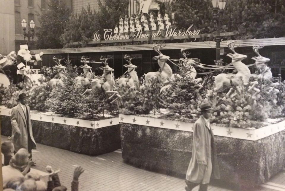
Back then,  Herpolsheimer's and Wurzburg's department stores were basically the Macy's and Gimbels of GR.

"When you went downtown to do your Christmas shopping, you always had to make a choice to go to Wurzburg's or Herpolsheimer's," Van Allsburg remembers.

Today, the Grand Rapids Art Museum is located on the former site of Wurzburg's. And the GR police department sits on the somewhat iconic corner of Monroe Center and Division, where Herpolsheimer's once was.

Before shopping malls, and certainly before the internet, shopping was a different experience, and department stores reigned. And for the kids, visiting the shopping at Christmas meant a visit to Santa Claus.
During the Christmas shopping season, Herpolsheimer's operated the "Santa Express"—a miniature train on a monorail suspended from the ceiling in the basement. While it looks cheesy and somewhat dangerous to me now, back then I'm sure it felt futuristic, like something straight out of the World's Fair.
The train in The Polar Express was based on a 482 Baldwin Steam train. When they made the movie, the train they referenced was the Pere Marquette, which is the rail line between Grand Rapids and Chicago. And the train they studied.... #1225 of course.

I myself, have very early holiday memories of The Polar Express, specifically because of the Breton Village Mall, where they always had an elaborate train set up, and the story was illustrated annually around Santa's Village.

In a season where tradition reigns, Grand Rapids looks a little different than it did when Van Allsburg was growing up. People head to the suburbs (or their desktop) to shop. But his story will continue to delight for as long as children have the ability to believe.

Wednesday, April 15, 2015

In Modern Ruin

Like Mackinac's majestic Grand Hotel, San Francisco's Victorian-era Sutro Baths are a relic of a time gone by. But unlike the Grand Hotel, the baths stand in haunted ruin on the shore of the Pacific Ocean.
Now part of the National Park Services, the site once housed seven pools of filtered and heated seawater, a museum, restaurants, tropical plants, promenades, and seating for thousands of spectators, all covered by 100,000 square feet of opulent glass.


Built by San Franciscan real estate tycoon Adolph Sutro in 1894, the baths never flourished, despite the millions of dollars he poured into them — adding various amusements and oddities over the decades. Sutro even built a rail line through the Presidio to service the baths and the Cliff House, yet they continued to struggle.
After Sutro died in the 1950s, the site was purchased by another entertainment mogul, who attempted to turn it into an ice skating rink. But the site still didn't turn a profit and, in 1966, a fire turned the baths to ruin.

Today, visitors wander over the ruins as though their the remains of the Romans or  Mayans. Often they wonder what ancient structure once stood on the shore, but in reality, it wasn't all that long ago that Sutro's Glass Palace stood in all its lavish glory.

Listen to the colorful history of the baths turned to ruins on 99% Invisible. Or, read the story in Sutro's Glass Palace, available on Amazon.

Friday, November 8, 2013

Coloring History

Sanna Dullaway, a self-taught colorizer, has been colorizing famous photographs from history. As the photos make their way around the internet, they are receiving both praise and criticism. 

I appreciate the work, but understand how this may be seen as changing and tampering with history. 


The color adds such life and expression to the imagery, the realism is startling. But in some cases, it also changes the meaning and tone of the photograph. And for some iconic photographs, this may change how we see historic events. 


I can't imagine the skill and patience it takes to do this—to notice the subtle differences in skin tone and the wrinkles and shadows of fabric. 

I think these images are a delightful project and a thrill to look through, but that for historical record purposes, the originals must stay as is! It would be an inaccurate representation of the past if we were to go through archived imagery and photoshop out elements, such as cigarettes, and i think this falls into a similar category.  


But it's still impressive, and I am glad we get to see the photos like this! See more of Dullaway's work here and on this imgur site. 

Wednesday, September 25, 2013

Living in History

Just north of Chicago, Illinois sits historic Fort Sheridan, Illinois— a very striking and unusual residential community on the shore of Lake Michigan. 

Fort Sheridan was originally developed as a US Army installation in the late 1890’s. Consisting of 94 contributing historic buildings on 640 acres of prime lakefront property, it was designated as a US historic landmark property in the 1980’s.
After the Army moved out in 1993, the historic building were restored to their original grandeur and adapted for modern living.

On my most recent visit to Chicago, I was driven through the community, and was struck by the heritage still present on the grounds. It beautifully 
blends tradition and modern amenities into a completely relevant and idyllic neighborhood. 
Restored officers’ mansions have become single family homes as well as townhouses/duplexes; and stables and soldiers’ barracks have been converted to stately condos.

These buildings are some of the most unique housing opportunities I've ever seen. They are all built to be architecturally similar, brownstone-like, building styles. And they all overlook 54 acres of Parade Grounds where no building structures can ever be built (by specific agreement with the US Government to develop the decommissioned army fort for private use). 

So if you feel like living in the past (but don't want to give up your modern amenities) check out the available properties at Fort Sheridan!


Wednesday, January 23, 2013

Travel Talk in the Land of Delight

Check out this documentary from 1949, called Roaming through Michigan. The 8 minute film was paart of a James FitzPatrick's "Travel Talks" series. It includes footage of Sleeping Bear Dunes, Mackinac Island, Traverse City, Leelanau and as well as other places.
The film is full of fun Michigan history, here's some of my favorites:
• Native Americans named the northern Michigan region Leelanau, meaning Land of Delight

• The 5 mile stretch of dunes on Lake Michigan were the World's largest moving sand dunes
• Glen Lake was considered one of the 4 most beautiful lakes in the World because of the constantly changing colors

James FitzPatrick was an American director specializing in travel films from the 1920s through '50s. These short documentaries were often shown on Turner Classic Movies channel prior to the broadcast of movies. His Travel talks series is notable for preserving city and landscapes before they were swallowed up by chains and skyscrapers.

Sunday, December 30, 2012

In your Satin Tights... Stop a War with Love

In the last 24 hours I have watched 13 hours of the original Wonder Woman. The complete Season 1. (seriously if I hear these lyrics one more time I may implode).

Now from a women's studies point of view, this show is a big cluster. Male fantasy disguised as women empowerment; A superlady in lingerie? With her own Clark Kent disguise that transfixes the lovestruck Steve Trevor? It's too bad all her powers lie in her accessories, and without them she's like any other (Amazon) woman.

But I digress... let's talk about amazing 1975 graphics! Now I know it's 2012, and I shouldn't judge.... but I just can't decide if the graphics make the show awesome or embarrassing. All I know, is that they make it great. Check out the how they overlapped animation and human elements together for they opening sequence.

But it's really the amazing spinning effects to transform Diana Prince into Wonder Woman that truly blow my mind (click to see the originals). A few episodes into the series they improved upon these drastically by adding impressive explosions. Incredible that she never drew attention to herself with a burst like that!
The show is really like a long-legged time capsule of technology and pop culture—oh, and a hatred of Nazi's. Like real strong hatred. 

Well go on Wonder Women, the World is waiting for you. (and your satin tights)

Wednesday, November 7, 2012

Changing Corporate & Personal Identities

In these email crazed days, there isn't often an occasion where I find the need to actually run a piece of letterhead through the printer. But there is no simpler example of design functionality over form, and I love to see letterhead done right!

Originally made popular during the advent of Industrial design and the invention of the printing press, letterhead allowed people and business to create an identity for themselves—letting people know who they are and what they do.

Notable and historic letterhead samples can be found on Letterheady.com. Now I scrolled down this page for quite some time, wondering when, or even, if it had an end. Using the archives is actually an easier way to browse. (December 2009 is where it begins, to ease your curiosity). But take a look—there is hundreds of amazing corporate and celebrity highlights. If they were arranged chronologically, it would be an incredible spanse of identity design history.

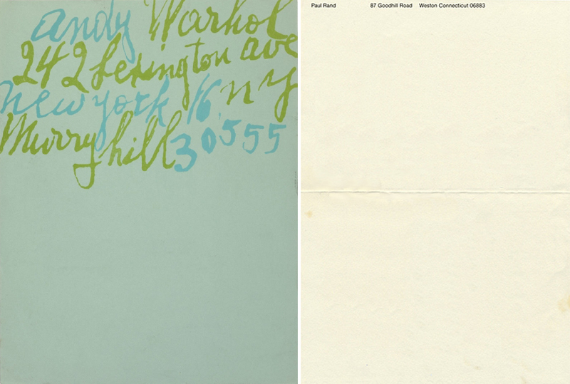
The whimsy of Warhol next to the modernism of Paul Rand
Dr. Seuss meets the Muppets
Calvin and Hobbes colliding with Nikola Tesla
Beautiful roofs that endure against Paranormal Activity

If you're interested in little more insight on the Evolution of Letterhead Design you can get it from inspirationfeed here.