Showing posts with label fonts. Show all posts

Thursday, June 30, 2016

A Family of Typophiles

I don't really think about fonts having a history prior to the digital age of computers and drop-down menus. But typography have been a factor since the 15th century and the advent of the printing press*. 

To put it in perspective, here's a timeline of approximate dates that some (perhaps familiar) fonts were developed:

1520s – Garamond
1722 – Caslon
1757 – Baskerville
1767 – Bodini
1818 - Didot
1928 – Gill Sans
1931 – Times New Roman
1957 – Helvetica
1982 – Arial
1994 – Comic Sans
2000 – Gotham 

Fonts surround as every day — Street signs. Menus. Newspapers. Emails. Most type isn't even noticed, which is usually how you know a typeface has been properly chosen.

In the book Just My Type,Simon Garfield goes through 500 years of typefaces. He tackles some important questions... How did Helvetica take over the world? Is Comic Sans the world's most hated font?? Did the font Gotham get President Obama elected???

It's somewhat of an academic read, and I believe you have sincerely love fonts to really get into it. But I thought it was interesting and full of tidbits that I later found myself sharing with others. Things like:
  • J is the last letter added to the alphabet—in the 1500s. If you Google this, people seem very concerned with how Jesus existed before the letter J did.
  • Eric Gill, the creator of Gill Sans, was a pervert. He sexually abused children AND a dog. Although he preferred to call himself "curious" rather than "perverse".
  • Times New Roman was commissioned by the British newspaper The Times. They used Times New Roman for 40 years. Since 1972, the paper has switched their font 5 times.
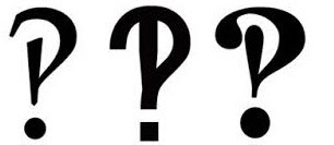
  • In 1962, an advertising company created the interrobang, or the interrogative point, for a campaign they were working on. The intention was to combine the functions of the question mark and exclamation point. It hasn't really caught on.
  • "The quick brown fox jumps over the lazy dog" is a pangram, a phrase that uses all the letters of the alphabet. It has been used to sample typefaces since the 1880s. The word "Hamburger" is often used when a single word sample is necessary, as it includes ascenders and descenders, and a variety of letter forms.
There was one controversial font that I found suspiciously absent from Garfield's book... Papyrus. Are we just out of things to say about it? Or is it better to just not acknowledge it?

*That makes them over 550 years old!!!

Tuesday, December 29, 2015

Fonts You Can Touch?

A few weeks ago I went to see Daniel Dejan speak on the Neoroscience of Touch, a lecture presented by Veritiv based on a printed piece by Sappi Paper of the same name.

The focus of the presentation was on the importance of tactile in meaningful communication. Since it was sponsored by a paper company, clearly the message was that paper is key to a brand experience

However, this was shown using a lot of interesting science, including haptics — the study of how what we touch shapes what we feel. Renowned neoroscientist and best-selling author Dr. Eagleman supplied the research that is the basis for the piece. Per Sappi's usual standards, it's a beautiful book... and the audience couldn't stop touching it.

Since I don't feel comfortable discussing the science behind Eagleman's research, I want to talk about the font on the piece.

Rigsby Hull, the Houston-based firm who designed the book, was inspired by a unique font they noticed in a reprint of a mid-1800s tome. As a result of this discovery, they developed a distinctive typeface — a revival and recreation of a font originally made by Jules Didot in the 1800s.

The Didot family had been in the printing, publishing and typography for generations. This new font is a variation of the time-honored classic Didot, but with rounded curves rather than sharp edges.

Rigsby Hull located the original 1842 volume of Jules Didot's fonts published as Specimen de la Nouvelle Foundrie in a collection at the Bibliothèque Nacional de France.

The font had never been commercialized so Rigsby Hull commissioned Dunwich Type Foundry to recut the font. This new version, dubbed Science Modern, is expected to be available for purchase in 2016.

#fontsarecool

Saturday, January 17, 2015

The P Word

This morning I went to  GR Detectives Day at the GR Public Library, which included six speakers delving into specific and unusual aspects of GR architecture and history. Tom Dilley, a very popular local historian, talked specifically of Egyptian Revival Art in GR's Oak Hill Cemetery. In his discussion, Dilley repeatedly referenced symbols and icons of Papyrus, and every time he said it, I flinched.

For a graphic designer, "Papyrus" is the dirtiest of all the dirty words. It's one step past "Clip Art". But I knew Dilley wasn't saying it to torture me, clearly there was another form of Papyrus out there....
Ancient Egypt was perhaps the first country to recognize national plants. These were the Lotus (water lily) and Papyrus, which symbolized Upper and Lower Egypt, respectively. 
The lotus and papyrus plants both symbolized the waters of Nun, from which the Egyptians believed life began. The papyrus, which grew in thickets along the Nile, became the symbol of fertility and life itself. As such, fresh papyrus stalks became a part of the offerings that the deceased took to the grave, and stylized papyrus stalks, with their sweeping flower umbels, were commonly used in architecture design.
 
The plant itself is much less offensive than the font, and given the proper climate, I'd consider adding it to my yard - though in the US the plant has proven to be somewhat invasive... how odd... that kinda sounds like the other Papyrus we know and hate...


Sunday, November 14, 2010


A Hate-Hate Relationship

Over the past several years, I have taught many how to recognize and detest Papyrus.


Papyrus was created in 1982, but it wasn't until over a decade later, when it was released on the Mac OSX standard platform in 2003, that it became a noticeable problem. The first year of it's Mac release Papyrus didn't ruffle my feathers, I may have even used it once or twice. But by 2005, I had grown to passionately despise the typeface.

My objection is simply overuse. It's everywhere: organic products, non-organic products, alternative healing methods, teas, snack foods, menus, cosmetic products, storefronts, Nathan Fillion movies (!), animated shows and multi-million dollar movies (including the subtitles???). It can also be seen all over basically any resort or beach town—I've been known to twitch when walking through the towns in the Outer Banks of North Carolina because I couldn't point out violations fast enough.

I'm not the only one startled (and annoyed) by the universal infatuation with a typeface that should really be used in moderation and in niche markets. And I'm not alone in the fight to educate civilians.

Here's some great Papyrus-centric Blogs:
Papyrus Watch: (Incidentally I've eaten at this deli in Camden, Maine, that they are posting about here and it's amazing! Also, Camden makes my list of top 5 US cities I wouldn't mind living in)
Attack of Papyrus
Say it With Papyrus

People were pretty irritated with Papyrus' Appearance in Avatar:
Fonts.com writes:
One would think that, in the $300,000,000+ budget for Avatar, there would have been some room for hir­ing a let­ter­ing artist or cal­li­grapher. If there was only $30 allot­ted to the sub­title typeface (which appears to be the case), designs like ITC Noovo™, ITC Tem­pus™ Sans, Briem™ Script or Car­o­lina™ would have car­ried off the alien and beau­ti­fully exotic demeanor of the Na’vi quite well – and would not have reminded the audi­ence of a res­taur­ant menu.

Papyrus has become a common punchline. Here's one of my favorite comics: (click to enlarge)


So familiarize yourselves with the type specs and be on the lookout. It won't be long before Papyrus slaps you in the face. And over the next few weeks, watch out for the holiday season's version of Papyrus: Almonte Snow.